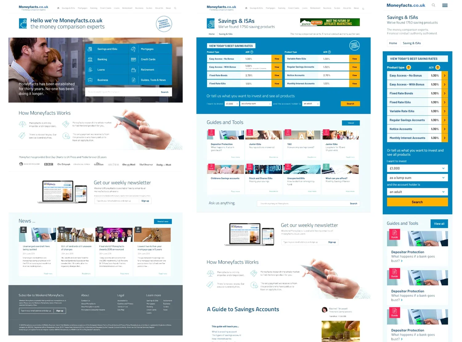
2017 | Service Design Director | Pancentric DigitalMoneyfacts is a long-established and trusted site for financial product comparison and guidance. However, over time it had become difficult to maintain and cumbersome to use. The company hoped to attract a younger user base with a design overhaul.
Background
Moneyfacts began life as a printed journal for comparing financial products like loans and mortgages, and the company prided itself on a robust, unbiased and accurate information. It had originally maintained much of its user base in the move to digital, but numbers had begun to drop in recent years as the site had aged and become harder to maintain.
The Moneyfacts team’s goals were to expand their user base, make their site easier to use and navigate, and less effort to maintain, with mobile compatibility also on the wish list. The team had a hunch that their user base was mostly an older demographic and hoped to attract younger audience in order to expand their numbers.
This project was one of the most thorough I’ve ever done in terms of quant and qual user research, and optimising a design to cater for user needs, priorities and thought patterns. I remain very proud that my team and I were able to help guide our client through the process from end to end.
Work & Outcomes
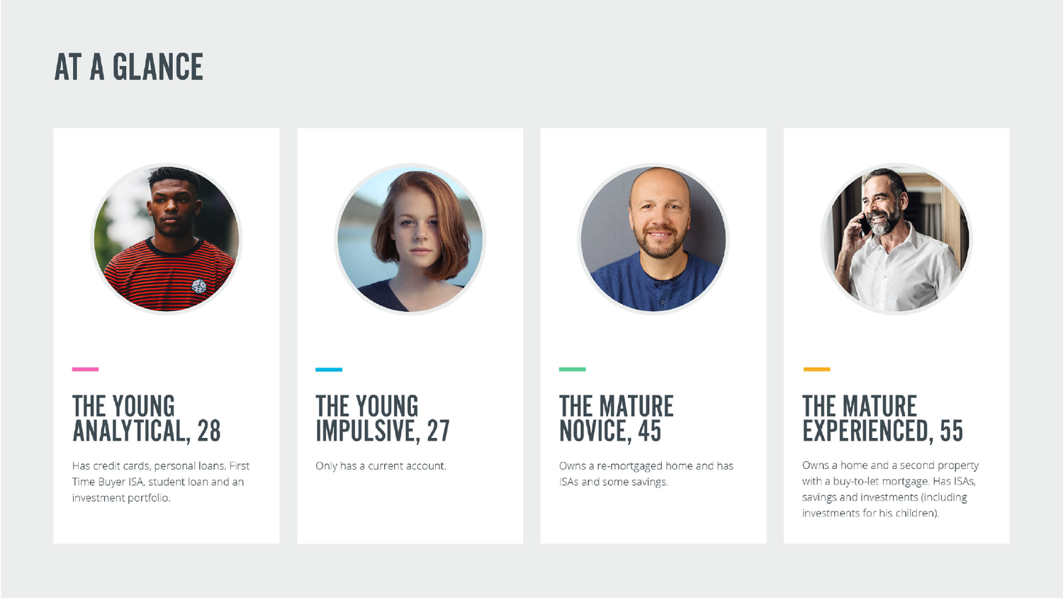
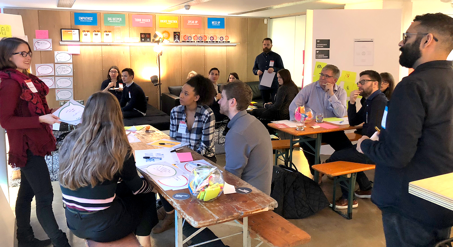
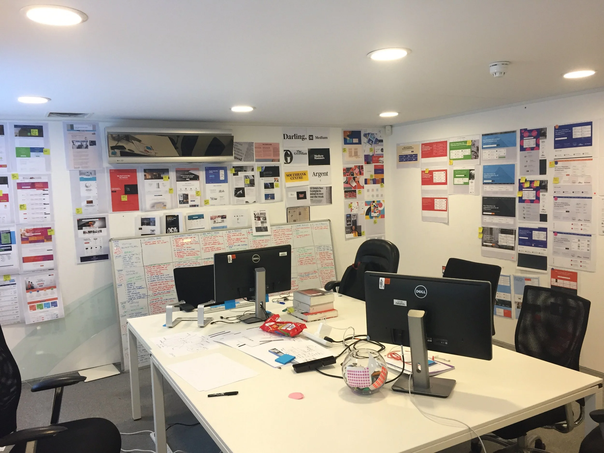
A thorough discovery phase included site data analysis, customer survey, in-person customer workshops, user interviews, usability tests on the current site, and SEO and competitor reviews. Interviews and workshops helped us understand goals and motivations for people of different ages and incomes to visit the site - revealing the needs of less financially-savvy older users, and how wide-ranging financial confidence was amongst younger people. Personas, user needs and outcomes to meet followed.
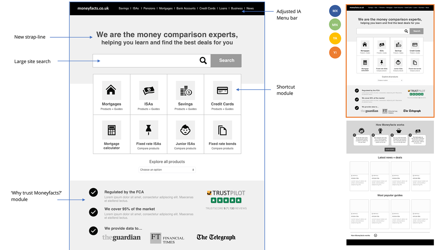
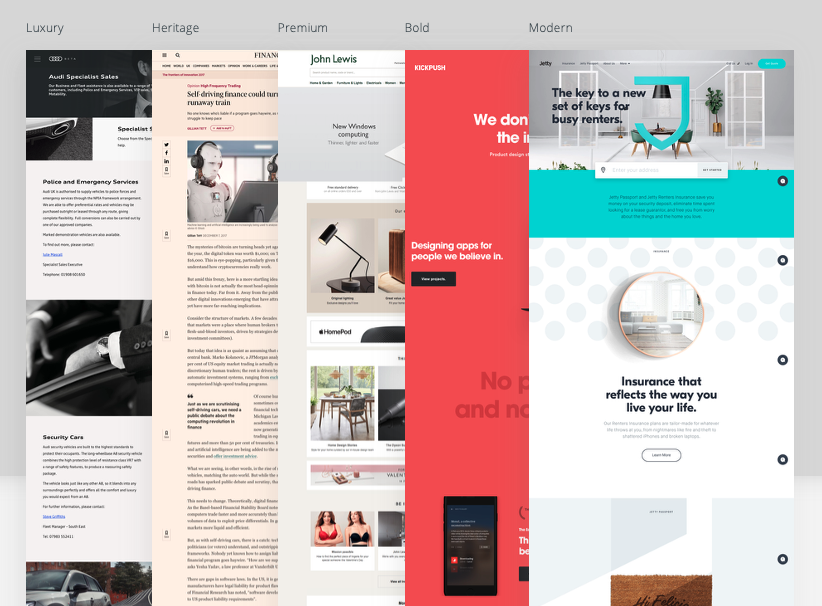
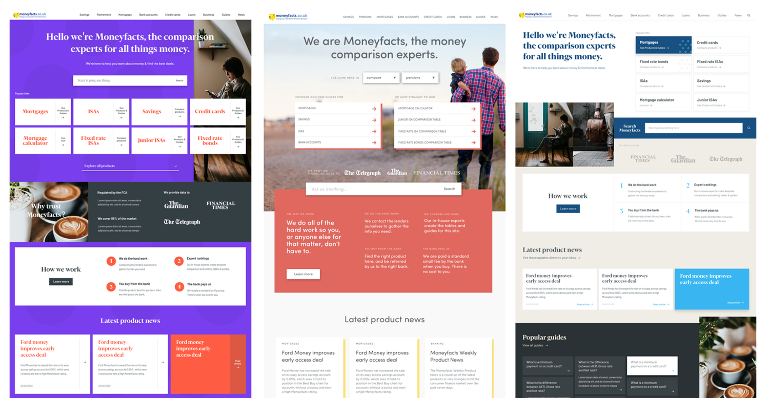
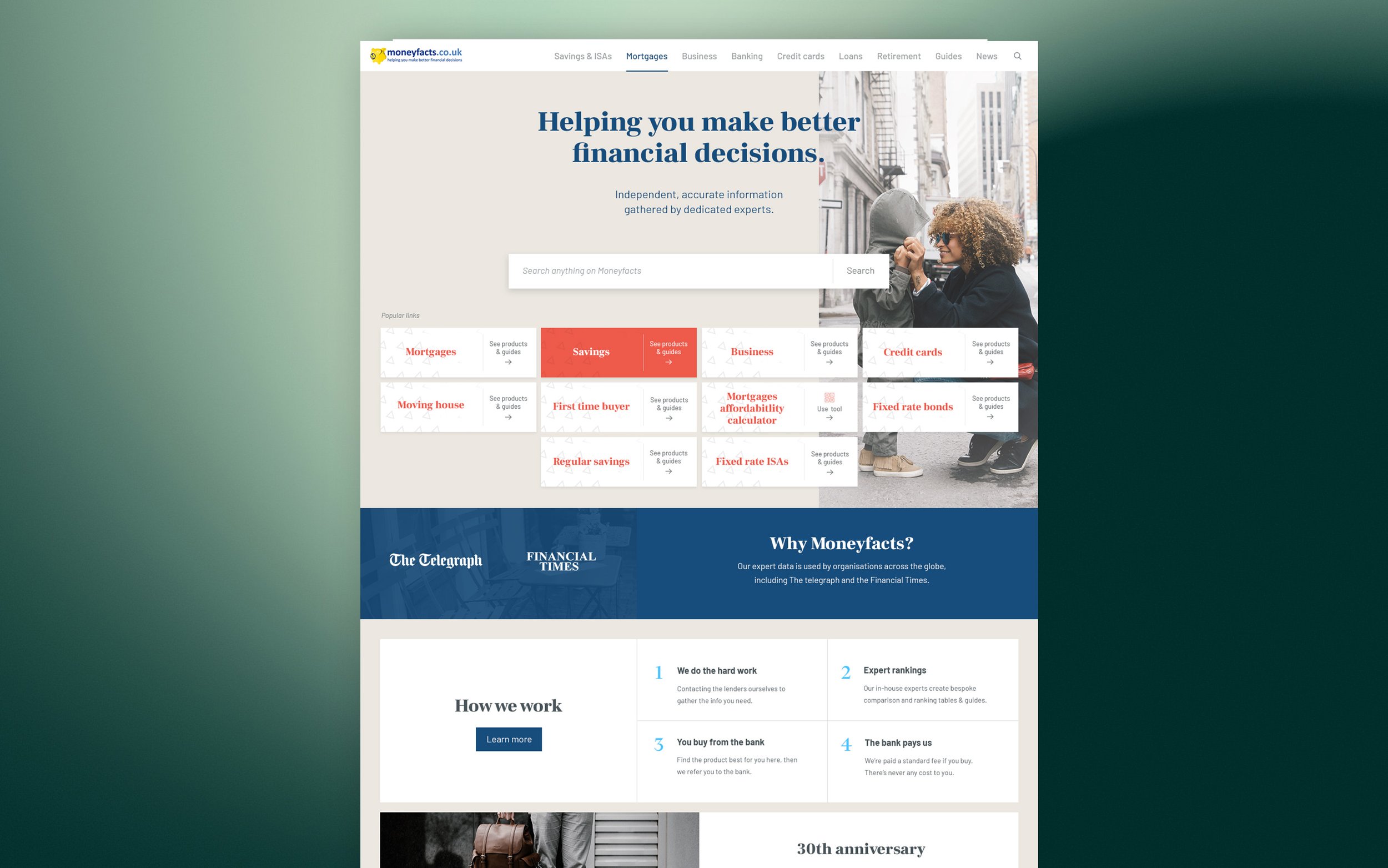
Design work included key messaging and content, terminology, navigation /IA, SEO optimisation and a thorough re-organising of on-screen information heirarchy, plus of course the expected UX, usability and visual design work.
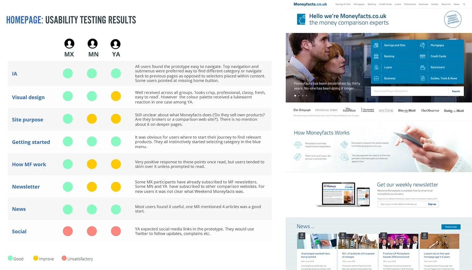
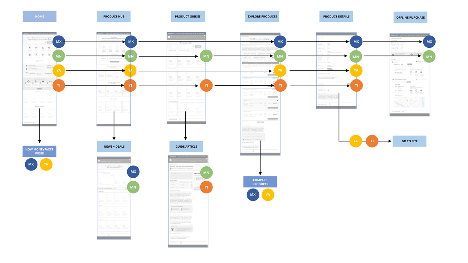
The design went through several iterations from wireframe to high fidelity, paying close attention to journeys on both mobile and desktop, and how quickly personas could access the information that mattered most. Usability testing and interviews (which I ran myself) gave us a firm understanding of how different people responded to the site and allowed a great deal of fine-tuning during build, to give our client confidence when it came time for launch.