2016-17 | Lead UX Designer | EEIn a six months at mobile network EE, I helped overhaul their broadband signup and iPhone purchase journey, increasing conversion on both. By introducing more open collaboration and quick, lo-fi design methods, I was able to help ship a more ambitious design than originally thought possible.
Background
Whilst the EE site saw a lot of steady traffic and customer conversion, it was less successful in persuading customers to signup for broadband. Additionally, a fragmented experience around buying, activating and getting support for new handsets meant teams were inundated with complaints and support work whenever a new iPhone launched.
Making major changes to user journeys across the site was difficult - product ownership was split amongst silo-ed teams with competing objectives, designers lacked a way to ensure UX consistency across teams, and user research and testing were not common or established practices.
My team and I were tasked with increasing conversion on broadband and providing a more streamlined purchase and support experience for buyers of the then upcoming iPhone 10 (X), with the goal of reducing complaints and support tickets.
Work & Outcomes
EE Broadband
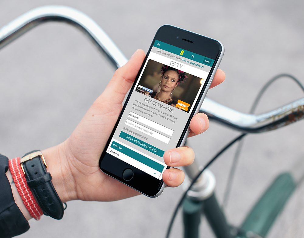
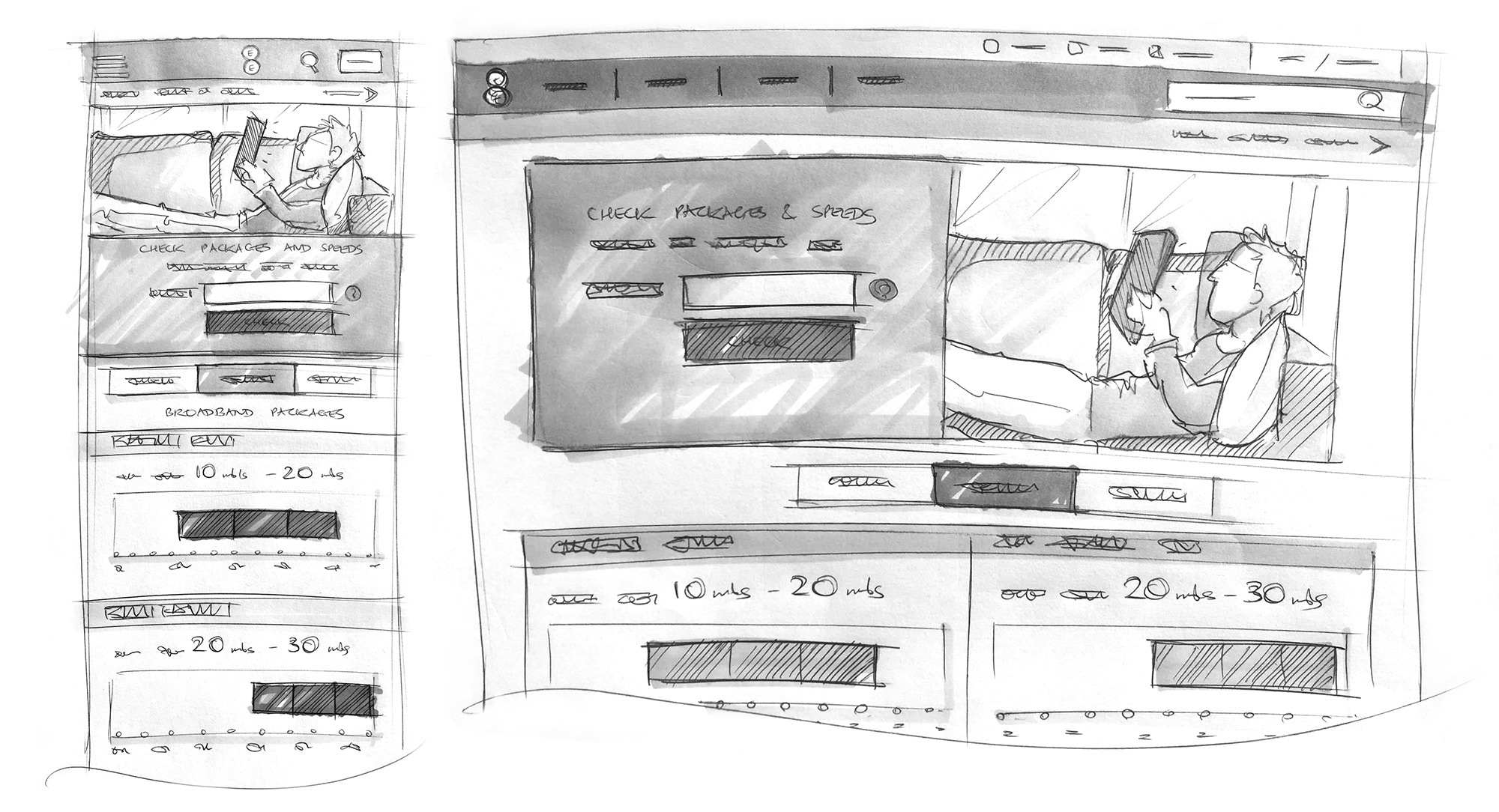
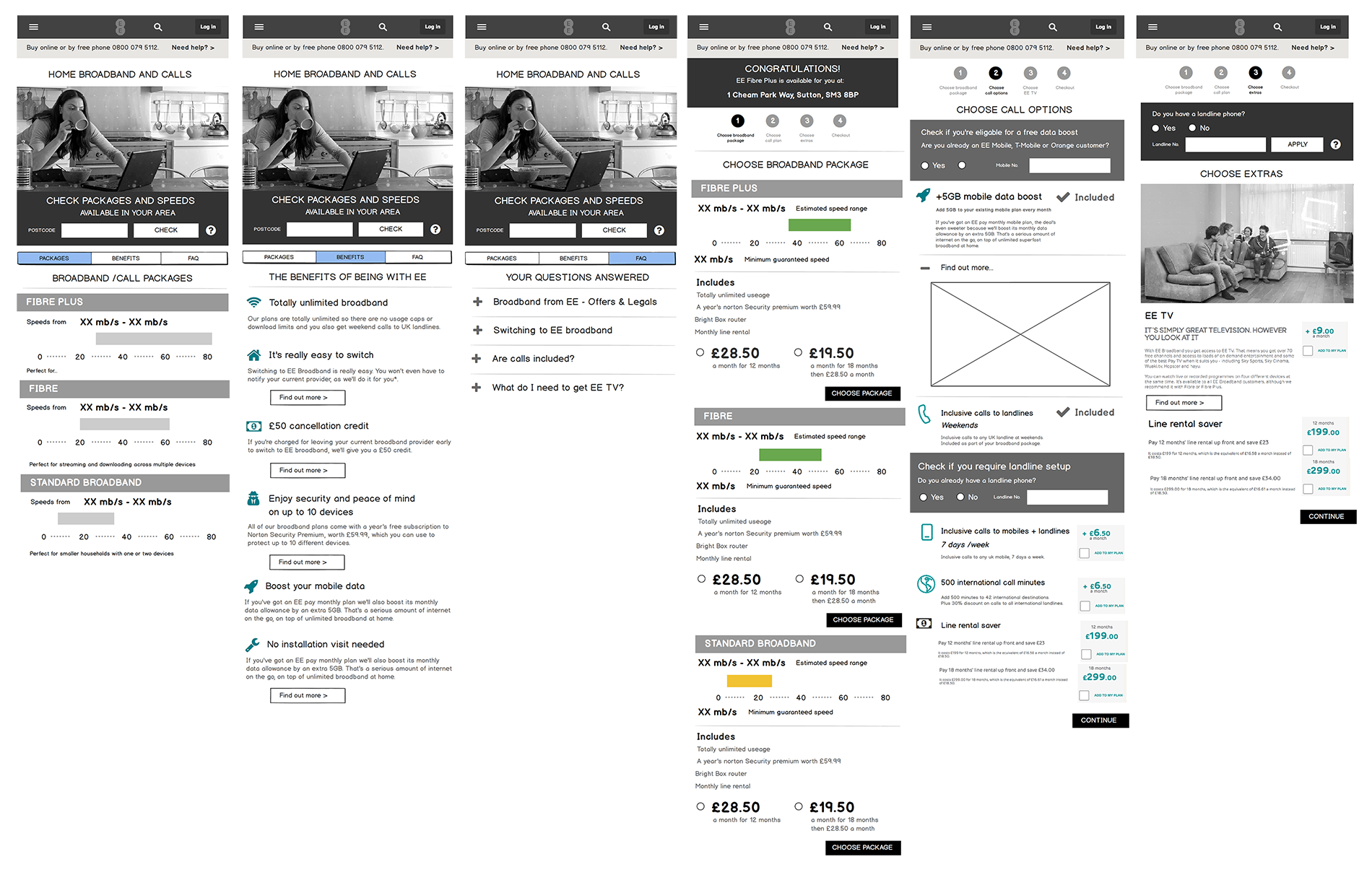
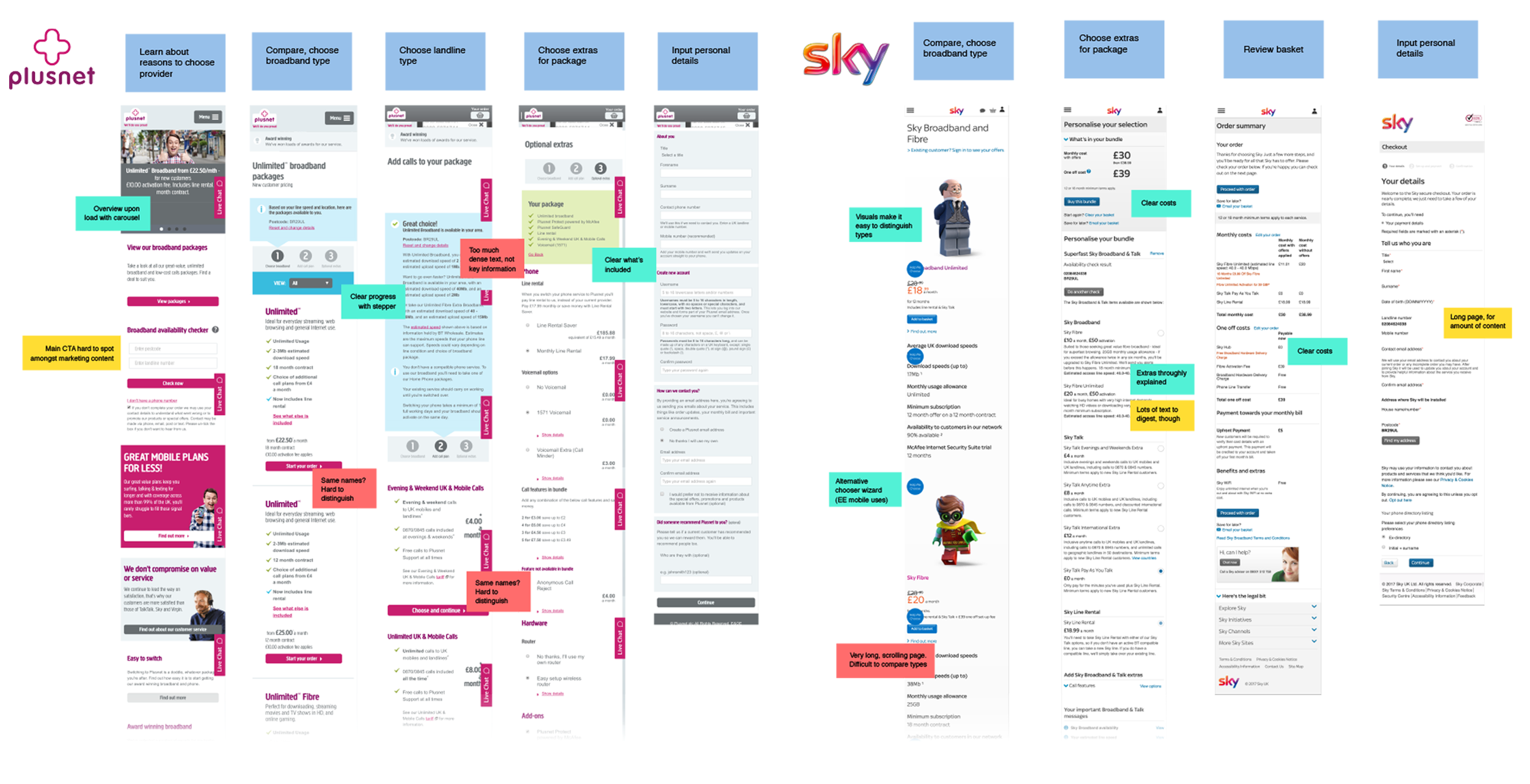
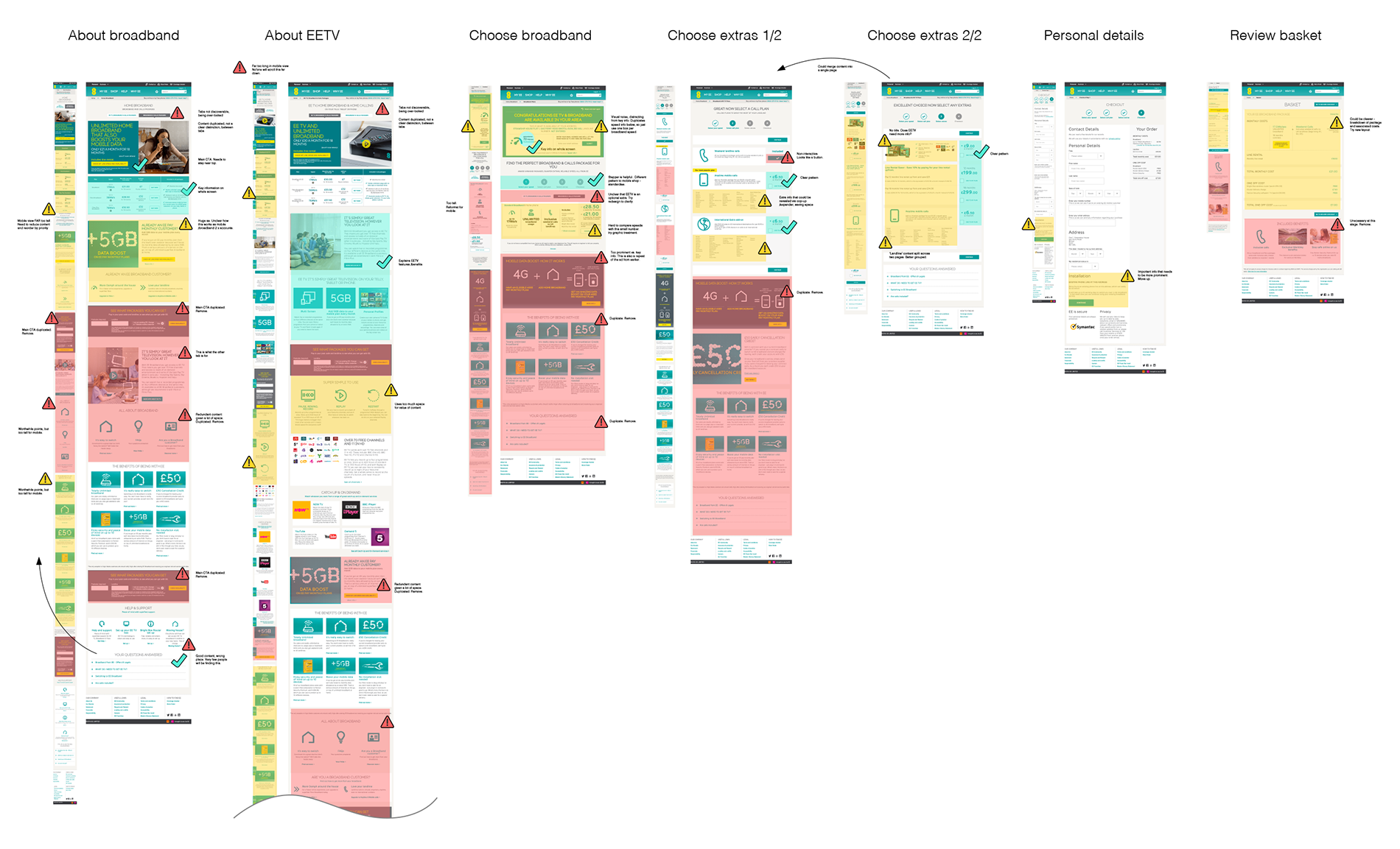
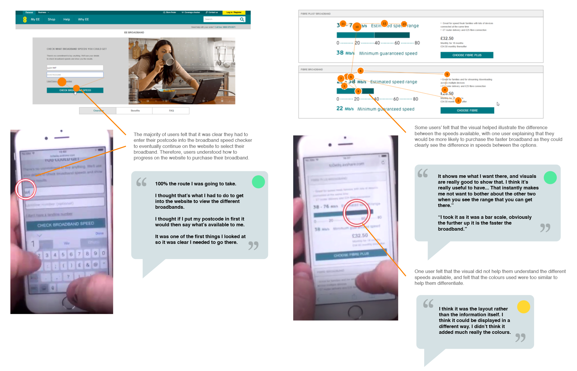
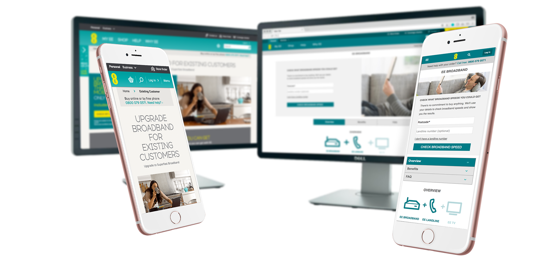
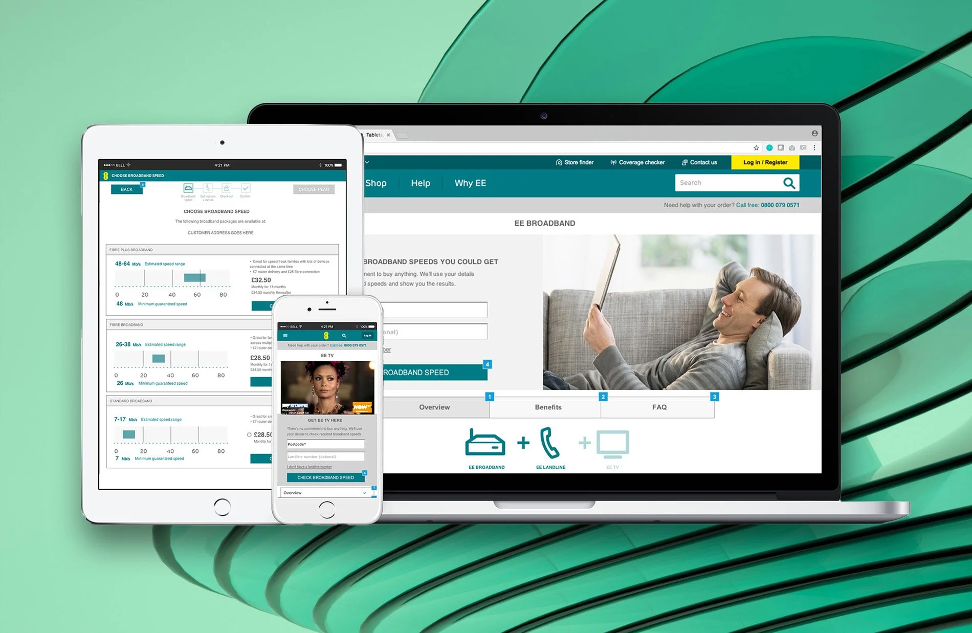
I assessed the current solution’s performance through usability testing, a review of journey data and heuristic evaluation, proposing areas for improvement to stakeholders. A key issue was how difficult it was to understand the difference between different broadband and landline phone packages, so I worked with marketing to more clearly define this, and proposed ways to communicate it clearly through UI and copy, working closely with copywriters.
Introducing interactive Axure prototypes for the first time, I used usability testing to prove the new package descriptions were clearer, usability was better and chance of conversion was higher.
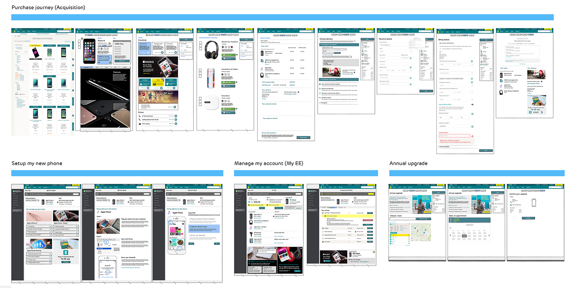
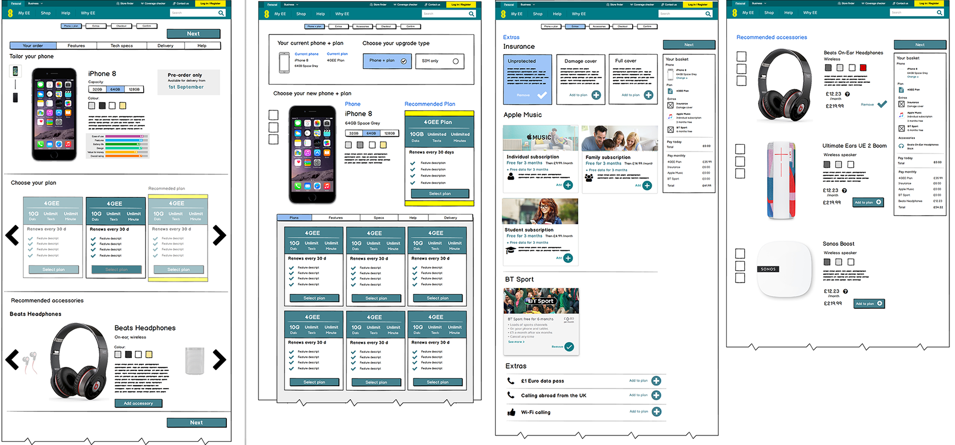
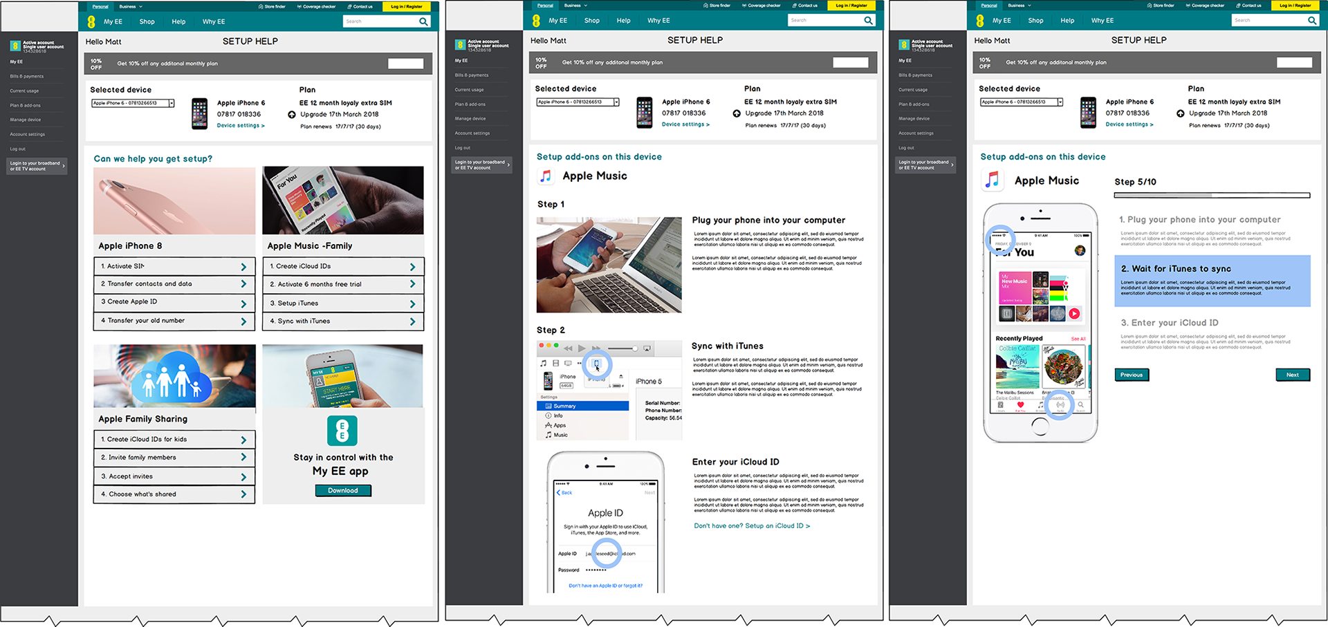
iPhone X Purchase
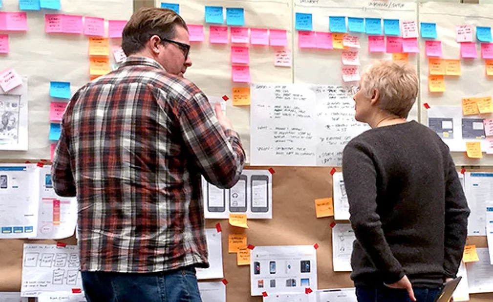
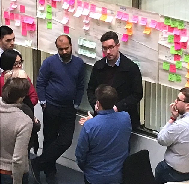
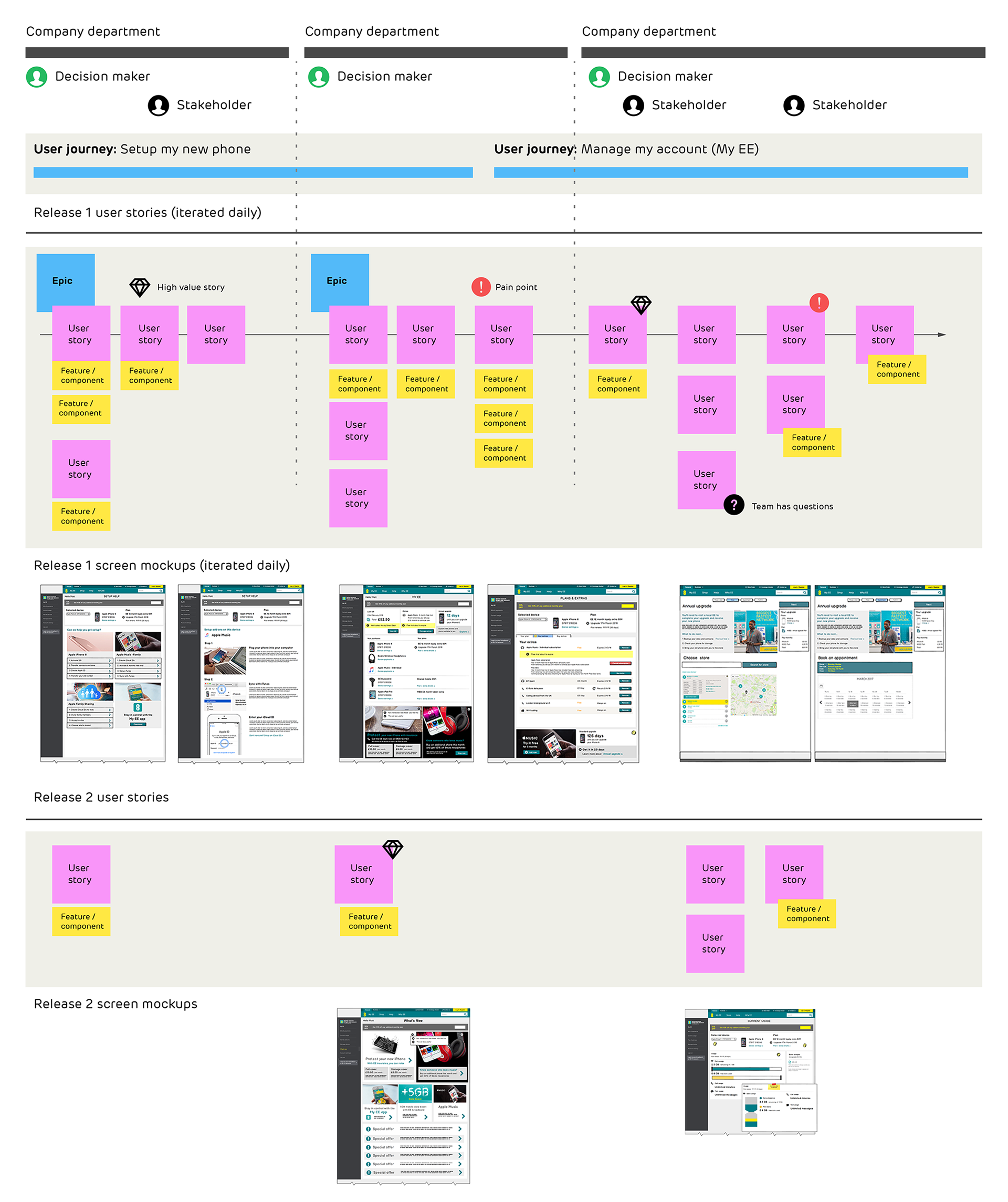
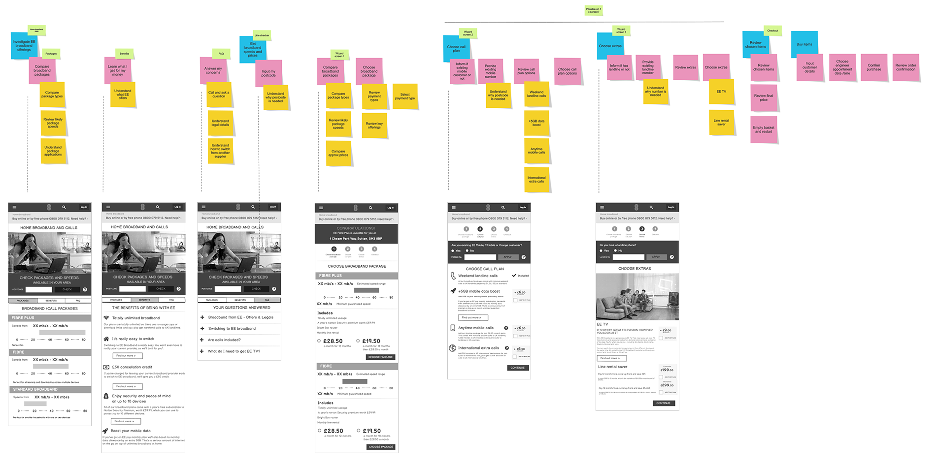
Ownership of the phone purchase, setup and support journeys was split across many silo-ed teams, and designers, PMs and stakeholders rarely got to discuss a holistic view together. Going entirely lo-fi, I taught the design team user story mapping. Our huge, post-it map in a corridor became the focal point for the whole project where everyone could meet, discuss and see how their page or features fitted into the whole.
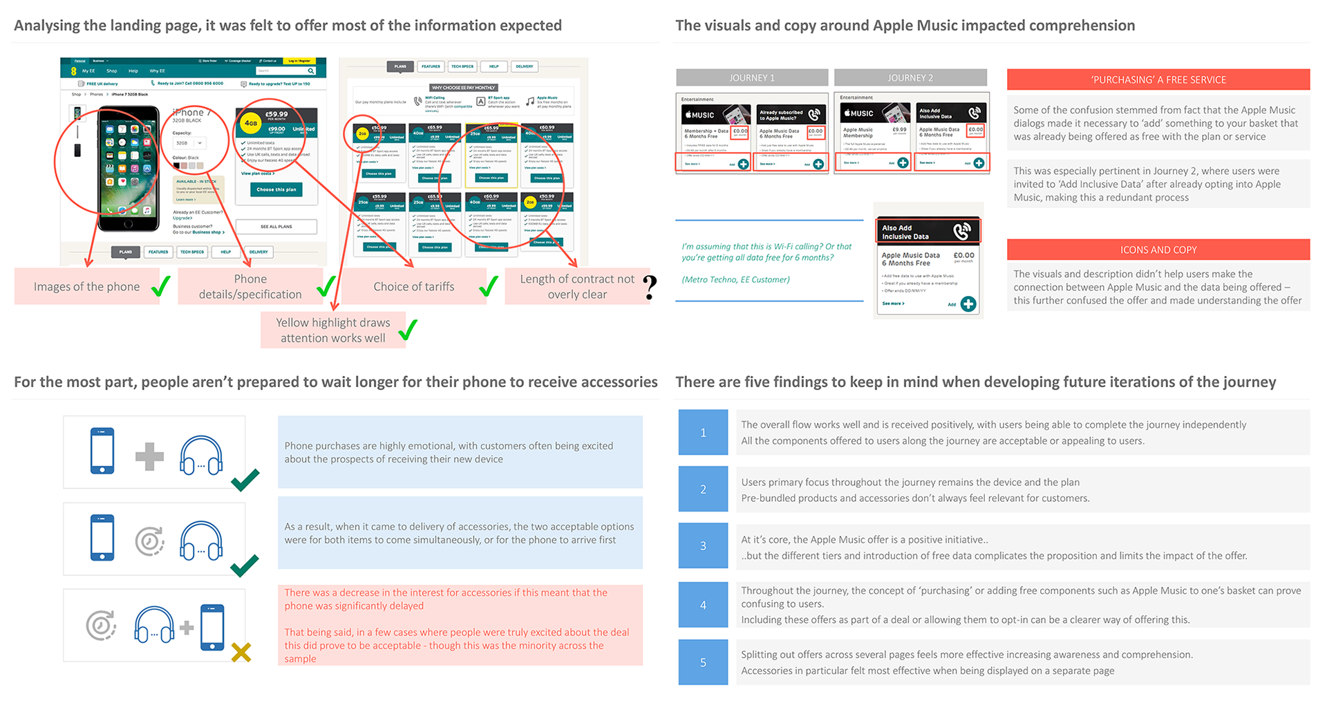
When user research wasn’t easy to get through formal channels, we did guerilla research by talking to customers in EE stores, and learning from support staff.
Together we designers were able to fix usability issues, get consistency of components and copy across teams and reduce friction in setting up and troubleshooting a new phone. Acting as one voice, it also became easier for us to win stakeholder approval for our proposals.